WEB DESIGN YORK

Image showing various screenshots of the website for Feel Good Menopause on different platforms - Web Design in York
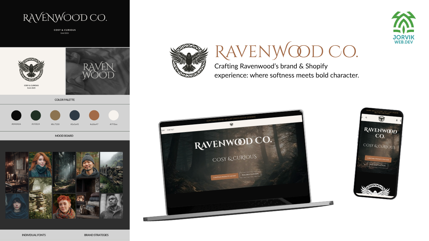
RAVENWOOD CO.

BRAND &

WEB DESIGN

SEMRush
74% to 96%
SEOptimer On-page SEO
C- to A+
A brand brought to life through thoughtful design, strategy, and storytelling
Ravenwood Clothing began with an idea and a mood, but no branding or online presence. We were approached to develop the brand further than the client's moodboard, and turn it into a functioning business. We worked alongside the client at every step of the way from brand development to launch in November 2025. As a team, we loved this project and the vision the client had for her clothing line.

From Moodboard to
Full Brand Design Guide

Ravenwood Clothing began as a concept and a mood board, so the first step was building the brand from the ground up. Our client had built out a detailed moodboard before our initial meeting, so we had a strong sense of the vibe and direction the brand needed to go.

Branding is instinctive for our lead designer, Hannah, so before designing anything, she needs to get into the right headspace.

For Ravenwood, that meant absorbing the client's mood board, finding music that matched the tone, and shutting out everything else so she could fully absorb the vibe, truly demonstrating the advantage of the ADHD hyper focus.
"When I focus like that, the brand direction tends to reveal itself... the typography, imagery, colour palette and the overall mood start connecting.

The vision starts to form in my head of how the client's idea will form and flourish in the constraints of a website. That became the basis of the style guide."
Hannah
Lead Designer

Logo design

With the brand direction set, the next stage was creating the logo. The client wanted a raven with open wings, something symbolic, grounded, and tied to her Celtic heritage that could also be printed easily.

Those elements were already present in the moodboard, so Hannah used them as the starting point.

She began with sketching. Before touching any software, she explored different silhouettes, wing shapes, and poses to find a balance between strength and softness.

Once the overall form felt right, she refined the details in Adobe Illustrator: the symmetry of the wings, the flow of the tail feathers, and the subtle knot work influences around the bird.

Cinzel Decorative was chosen for the typography because it matched the tone of the brand by being serifed, carved, almost elemental, but still clean and importantly, readable.

It paired naturally with the illustrated raven, giving the identity a sense of tradition without feeling heavy.
Ravenwood Clothing Brand Design Guide - Jorvik Web Dev

Collecting the product data

Before the Shopify build could begin, the product information needed to be organised.

This is where Hannah guide's the client through preparing a product spreadsheet in Google Sheets that mirrors Shopify’s CSV format.

Having this information prepared in a structured spreadsheet allows for a clean, efficient import into Shopify.

It also ensures that the products are consistent, properly categorised, and ready for automated collections later in the build.

The goal is always the same in order to make the process as smooth as possible:

1) set up the store with accurate data

2) use consistent naming conventions, thinking about SEO this early on

3) starting with a solid backend structure that supports growth from the outset

Design & Development in Shopify

With the branding complete and the product data prepared, the next stage was building the website in Shopify. This part of the process combines UX, custom design, and technical development to create a store that feels cohesive and functions smoothly.

Theme Selection
While the theme acts as the foundation, the choice here isn’t about picking a “finished” design — it’s about selecting the structure and features that most closely align with the project.
For Ravenwood Co, I chose a clean, flexible theme that allowed for full customisation.
The aim wasn’t to rely on the theme’s presets, but to use it as a stable framework for:Custom typographyAtmospheric layout choicesModified navigationBranding-driven sectionsThis approach ensures the build is completely tailored, regardless of the starting theme.

UX Design for the Homepage
The homepage is designed around customer behaviour, not just aesthetics. For Ravenwood, this meant creating a layout that guides visitors through the atmosphere of the brand and towards the most important actions.Key decisions included:A strong hero section to set the tone instantlyFeatured collections placed where engagement is highestClear pathways to shop categoriesA balance of imagery + whitespace for sensory comfortStrategic call-to-action placement to support conversionSection spacing tailored to the brand rather than the theme defaultsEvery part of the homepage was designed intentionally, making the customer journey feel calm, intuitive, and on-brand.

Custom Code Integration
Because Ravenwood Co uses Cinzel Decorative — a non-standard font — I added custom code to bring the typeface into Shopify and apply it consistently across headings. This allowed the typography to match the brand style guide rather than being limited to built-in fonts.Additionally, the navigation required customisation:Positioning and sizing adjustments to support the logoImproved spacing and alignmentAdjusted header height for a more balanced layoutThese refinements ensured the header looked deliberate and matched the rest of the brand, not just the theme defaults.If you want, we can also mention any minor Liquid/CSS adjustments (colour variables, button styles, spacing tweaks) — which are usually part of your workflow.

Custom Built About Page
Instead of relying on Shopify’s basic text section, the About page was designed manually to match the brand style guide.This included:Structured content blocksCustom section layoutsVisual hierarchy that mirrors the homepage stylingA mix of text, imagery, and spacing to create a calm, readable flowTone-appropriate storytelling based on the brand’s directionThe result was a page that feels handcrafted rather than generic — something especially important for new brands establishing their identity.

Additional Development Work
A few more elements strengthened the build:
Consistent button and colour styles adjusted through custom CSS

Improved mobile layout, with special attention to spacing and readability

Optimised product page structure, ensuring descriptions, images, and CTAs load in a logical order

Setting up automated collections, so future products slot into the right categories without manual work

Clean, branded footer design, including social icons, policies, and navigation

Accessibility considerations, such as readable font sizes, alt-text, and good contrast

These details create a smooth customer experience and make future updates easier for the owner.
Jorvik Web Dev Web Design Logo
Get started today

Your new website awaits

Let's create a website you can be proud of