
Why I builtmy ownclient portal
For a long time, managing client projects at Jorvik Web Dev looked organised from the outside. Behind the scenes, it was spread across four different tools, a busy inbox and a worrying amount of my own memory.
ClickUp and Notion are both good products. I'm not going to tell you they're rubbish, because they aren't. But ClickUp felt like learning to fly a plane so I could post a letter, and Notion needed so much setting up that I spent more time building the system than using it. Every new project meant bending a template that never quite fitted, and every client had to learn yet another login just to send me their logo.
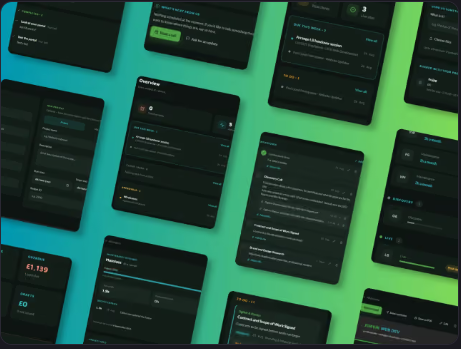
So I built my own. The JWD Client Portal is now where every project lives, and if you work with me, it's where you'll find everything. Here's how it came about, why it looks the way it does, and what it actually changes for you.
The problem wasn't the tools, it was the fit
Most project management software is built for teams. Lots of people, lots of handoffs, lots of meetings about the meetings. I'm a one-woman studio working with small businesses, and what I needed was much simpler:
- one place for each project
- one place for clients to send me files
- one place to see what's due
- one place for invoices
What I had instead was four tools doing slightly overlapping versions of those jobs, none of them talking to each other, and me in the middle copying things from one to another.
The other problem was rigidity. Off-the-shelf tools love a template. Set up your workflow once, then every project follows the same steps. That sounds efficient until you realise that a five-page brochure site and a big CMS build with integrations don't follow the same steps at all. I kept deleting stages that didn't apply and inventing workarounds for ones that weren't there.
So the brief I wrote for myself was short. One system. Flexible for each project. Simple enough that a client could use it without a tutorial.
Designing it around how my brain actually works
Here's the bit I don't usually say out loud on a business blog: I'm AuDHD, which means autistic and ADHD. It's a big part of why I'm good at what I do, and a big part of why generic productivity tools never stuck for me.
Two things matter most when I'm planning work.
The first is dopamine. ADHD brains run on momentum and visible progress. If I can see that things are moving, I keep moving. If all I can see is a mountain, I freeze.
The second is demand avoidance. When something lands as an instruction, even one I've set myself, part of my brain digs its heels in. A to-do list that greets me first thing in the morning can stall the whole day before it's started.
I didn't run a formal study before building the portal, but I wasn't guessing either. I'd spent years reading and learning about neurodivergent behaviour, including how visual reminders work for brains like mine and how the way a demand is framed changes how it feels. Put that next to the lived experience of running JWD every day, and I had a pretty clear idea of what the interface needed to do before I designed a single screen. I sketched it by hand first, worked it up in Figma, then built it one feature at a time.
A few decisions came straight out of that thinking.
- The numbers come first. When I open the dashboard, the first thing I see is a set of stats: how many projects are live, how many things are overdue. It's information, not an instruction, so it doesn't set off the demand-avoidance alarm. Seeing a healthy number of live projects is also a small win before anything difficult is asked of me. Momentum, not dread.
- "To do" and "due this week" are separate. The to-do list holds everything, in date order, sometimes stretching weeks ahead. That's useful, but a long list doesn't grab my attention, however neatly it's sorted. "Due this week" is the same information filtered down to what actually needs doing now, so I plan my days around what's real rather than everything that's been logged.
- Urgent things live in a highlighted box. Executive dysfunction means time-sensitive tasks can quietly disappear in a flat list. A highlighted box registers before I've even read it, so nothing important depends on me reading carefully enough to spot it.
- Status is written in words. Colour helps, but it's never the only signal. If something is overdue, it says so.
- Different views for different days. Kanban boards, lists and charts sit side by side. Some days I need to see a project as a board, some days as a list. The portal doesn't make me pick one and stick with it.
Designing for brains like mine isn't a niche. It's just good design with the excuses taken out.
Four weeks from sketch to daily use
I built the first working version over about four weeks.
For anyone curious about what's under the bonnet, it's a custom web app built with Next.js and TypeScript, with Supabase handling the database and secure logins, Resend sending the emails, and Vercel hosting it all. I used Claude Code as a coding assistant to speed up the build, but the design decisions, the structure and the reasons behind every screen were mine, worked out on paper before any code was written.
If none of those names mean anything to you, that's completely fine. What matters is that it's fast, it's secure, and because I built it, I can change it. When a project needs something the portal doesn't do yet, I don't have to wait for a software company to add it to their roadmap. I just add it.
The most important feature didn't look like much on a wireframe. When I set up a new project, I choose the stages and milestones it actually needs. A quick brochure site gets a short, simple path. A bigger build gets more checkpoints. Nothing is forced into a shape that doesn't fit, which was the whole reason I started.
What it means if you're a client
This is the part that really matters, because the portal isn't just for me. It was built to be handed to a client from day one.
- You get one link, not another account to manage. I invite clients personally, project by project. There's no public sign-up and no setting up a profile. You get an invitation, you log in, and your project is there.
- You can see where things are. Your dashboard shows what's done, what's next and when it's due. No more emailing to ask "where are we with the website?", because the answer is already there.
- You know what I need from you. Websites always need things from the client: copy, photos, logins, feedback, sign-off. These show up as clear tasks with dates, so you're not digging through old emails to remember what I asked for.
- Files go straight to the right place. Upload your logo, photos and documents directly to your project. No more "this file is too big to email" or links that expire before I've opened them.
- Invoices live alongside the work. You can see and download your invoices in the same place as everything else, so you're not searching your inbox at tax time.
- Reminders happen automatically. Project timelines and reminders run on their own rather than relying on either of us remembering. Things don't slip through the cracks because someone was busy that week.
- Your information stays private. Access is role-based, which means you see your own project and nothing else. Anything that isn't relevant to you is hidden by default. When a project finishes, its data is archived, and it's cleared completely after two years.
And because the portal follows the same design thinking I described above, it's calm to use. You won't log in and get hit with fourteen buttons and a notification count. You'll see what's happening and what you need to do, and that's it.
What's actually changed
The portal is now in daily use across eight live client projects. Four separate tools have become one. By my own rough estimate, it gives me back somewhere between five and ten hours a week, which is time I'd much rather spend designing and building than chasing files and updating spreadsheets.
Onboarding a new client is now a single guided path instead of a checklist living in my head. Communication sits in one place rather than scattered across email threads. And for the first time, the way I manage projects actually matches the way I work, rather than me constantly fighting a tool built for someone else.
For clients, the change is quieter but just as real. You always know where your project is, what's next, and what's needed from you. It's the kind of thing you only notice when it's missing.
What's next
If you're thinking about a new website, or your current one needs some love, I'd be glad to show you how working together looks in practice. Book a free chat and I'll walk you through it.
Want our best Tips, Tricks & Offers?
Want someone to just do it for you?
Reading about how I work is one thing. Having your website sorted while you focus on running your business is another. That's what we're here for.