
UX DesignFor SmallBusiness Owners
No "leverage synergies". No "disruptive paradigm shifts". Just straightforward answers to the questions small business owners actually ask — usually at 11pm on a Sunday.
10 Simple Laws to Fix It Before They Leave Forever
My first business website looked like a neon-green fever dream from 1997 because I thought being "unique" was the same thing as being "good."
Honestly, it wasn't. It was just a great way to make sure nobody ever bought anything.
We're going to talk
about UX
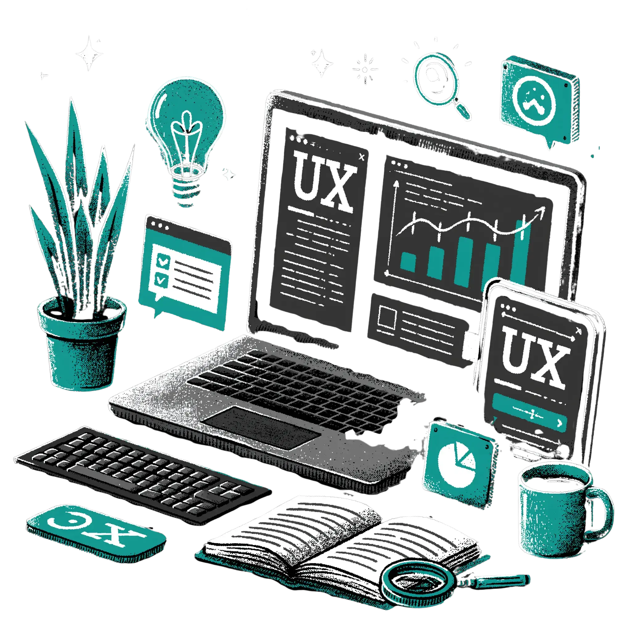
It stands for User Experience, which is just a fancy, slightly pretentious way of saying "how someone feels when they’re using your site". If they feel confused, they leave. If they feel smart, they stay.
The goal here isn't to turn you into a professional designer or a corporate consultant.
You don't need a degree to stop annoying your customers. Whether you’re DIY-ing your site on a Tuesday night or briefing a designer you’re paying actual money for, these 10 laws will keep you from making the mistakes I did.
Grab a tea or coffee. Let’s do this.
The 10, arguably best,
Laws of UX Design
Let's start with a summary, because who has time to read a full blog post these days. That being said... if you click on the card for each law, it will take you to its section to show you visual examples for each; what works, what doesn't work and how to get it right.

Jakob's Law
Users spend most of their time on other sites, so they prefer your site to work like the ones they already know.

Hicks Law
The time it takes to make a decision increases with the number and complexity of choices.

Miller's Law
The average person can only keep about 7 items in their working memory at once.

Law of Proximity
Things that are close together are perceived as being related.

Cognitive Load
The amount of mental effort it takes to use your site should be as low as possible.

Fitt's Law
The time to acquire a target is a function of the distance to and size of the target.

Von Restorff Effect
When multiple similar objects are present, the one that differs from the rest is most likely to be remembered.

Serial Position Effect
People remember the first and last items in a list better than the middle ones.

Aesthetic-Usability Effect
People perceive "pretty" things as being easier to use.

Jakob's Law

Users spend most of their time on other sites, so they prefer your site to work like the ones they already know.
Because they spend 99% of their time on sites like Amazon, Google, or Instagram, they’ve already been "trained" on how a website should work.
If you decide to put your search bar at the bottom of the page or make your logo link to your Instagram instead of your homepage, you’re just making them work harder.
And trust me, nobody wants to work hard to give you money
The 'so what?' for you...
If you try to be too "creative" with the basic layout, people will feel lost and hit the back button faster than you can say "missed conversion".
Honest Truth: Innovation is for your product, not your "Add to Cart" button.
Try this right now:
- Open your site on your phone.
- Is your logo in the top left?
- Is there a "hamburger" menu (those three little lines) in the top right?
- Is your contact info easy to find?
If you answered "no" to any of these because you wanted to be "different," change it back.
Hick's Law
The time it takes to make a decision increases with the number and complexity of choices.
You sit there for twenty minutes, get overwhelmed, and then just order the same burger you always get.
That’s Hick’s Law in action.
On a website, "analysis paralysis" is real. If your homepage has 15 different buttons and a menu with 20 sub-items, your visitor is going to get "choice fatigue" and just close the tab.
The 'so what?' for you...
Try this right now:
Count the items in your main navigation menu. If it’s more than seven, you’re pushing it.
- Can you group those services under one "Services" tab?
If you have three different "Buy Now" buttons for the same thing on one page, pick the best one and kill the rest.
Miller's Law
The average person can only keep about 7 items in their working memory at once.
Our "working memory" (the brain’s sticky note) is tiny. If you give someone a wall of text with 15 bullet points, they’ll remember the first two and the last one, and the rest is just white noise.
This is why we "chunk" information. It's why phone numbers are written as 555-0199 instead of 5550199. It’s easier to digest.
The 'so what?' for you...
Try this right now:
Look at your "Services" or "Features" section.
- Is it a massive list?
- Try grouping them into 3 or 4 categories with icons.
It’ll look cleaner and actually get read.
Law of Proximity
Things that are close together are perceived as being related.
If we see a photo and a caption right under it, we assume they go together. If there’s a massive gap between them, we get confused.
I once had a site where the "Sign Up" button was so far away from the "Join Our Newsletter" header that people thought the button was part of the footer.
Oops.
The 'so what?' for you...
Honest Truth: Whitespace isn't "wasted" space. It's the "breathing room" that keeps your customers from feeling claustrophobic.
Try this now:
- Look at your contact form.
- Are the labels (like "Email Name") sitting right on top of the boxes they belong to?
If they're floating halfway between two boxes, your customers are going to put their names in the email box. Not ideal
Cognitive Load
The amount of mental effort it takes to use your site should be as low as possible.
This is called Cognitive Load.
Think of your customer’s brain like a phone battery. If your site is "heavy" and confusing, that battery hits 0% real fast, and they leave.
The 'so what?' for you...
Try this now:
Read your homepage aloud to someone who doesn't work in your industry (your mum, your neighbor, the person at the coffee shop).
If they have to ask what a sentence means, rewrite it in plain English.
If you use a word like "synergistic," delete it immediately.
Fitt's Law
The time to acquire a target is a function of the distance to and size of the target.
If you want someone to "Book Now," don't make that link a tiny, underlined piece of text in the middle of a paragraph.
Make it a big, juicy button.
The 'so what?' for you...
Try this now:
Open your site on your mobile phone.
- Can you easily click your main call-to-action button with your thumb without accidentally clicking something else?
If you have to zoom in to click a link, your button is too small.
Von Restorff Effect
When multiple similar objects are present, the one that differs from the rest is most likely to be remembered.
This is great for your "Buy Now" button, but terrible if you’ve used that same bright orange for five different things that aren't important.
The 'so what?' for you...
Honest Truth: If your website looks like a bag of Skittles exploded on it, nobody knows where to look. Pick one "action colour" and stick to it.
Try this now:
Open your site on your mobile phone.
- Can you easily click your main call-to-action button with your thumb without accidentally clicking something else?
If you have to zoom in to click a link, your button is too small.
Serial Position Effect
People remember the first and last items in a list better than the middle ones.
If you’re listing your services or your menu items, put the most important ones at the very beginning and the very end.
The 'so what?' for you...
Try this now:
Check your navigation menu. Is "Home" first? Good. Is "Contact" or "Book" last?
Excellent.
If your most important service is buried in the middle of a five-item list, move it to the first or second spot.
Aesthetic-Usability Effect
People perceive "pretty" things as being easier to use.
If it looks like it hasn't been updated since 2005, they’ll assume your business is also outdated or worse, unreliable.
A "pretty" design buys you forgiveness for small mistakes.
The 'so what?' for you...
Use a free tool like Google PageSpeed Insights or SEOptimer to make sure your "pretty" site isn't also a "slow" site, because people hate waiting.
Try this now:
Look at your fonts.
- Are you using five different ones? Stick to two.
- Are your photos blurry?
Replace them with high-res shots (even from your phone!). It's a cheap way to look expensive. You can convert them to webp files, which are best for web optimisation, for FREE at Squoosh
Occum's Razor
The simplest solution is usually the best one.
Occam’s Razor says: stop it.
The more "stuff" you add, the more chances you have to confuse someone or break your site.
Simplicity is the ultimate "pro" move.
The 'so what?' for you...
Your site isn't finished when there’s nothing left to add; it’s finished when there’s nothing left to take away.
Honest Truth: Nobody ever left a website because it was "too easy to use".
Try this now:
Find one thing on your homepage, whether that's a widget, a social media feed, a paragraph of text, that you haven't looked at in a month. If it doesn't help someone buy from you, delete it.
You've done it!
If you’ve made it this far, nice one! You officially know more about website design than 90% of your competitors.
You don't need to nail all 10 of these today.
Honestly, if you just fix your "thumb-sized" buttons (Fitts's Law) and stop trying to be "creative" with your menu (Jakob's Law), you’re already winning.
Your website is a tool, not an art project. Its job is to make your life easier and your customers' lives better.
> Don't get in their way.
>Keep it simple, keep it familiar, and for the love of all that is holy, make the buttons big enough to click.
Now go finish that tea or coffee and go fix one thing. You’ve got this.
Want our best Tips, Tricks & Offers?
Want someone to just do it for you?
Reading about UX design and SEO is one thing. Having it sorted while you focus on running your business is another. That's what we're here for.